Button
3 min
Button
Simple and versatile button component. Offers a range of visual variants as well as several actions that can be performed on click.
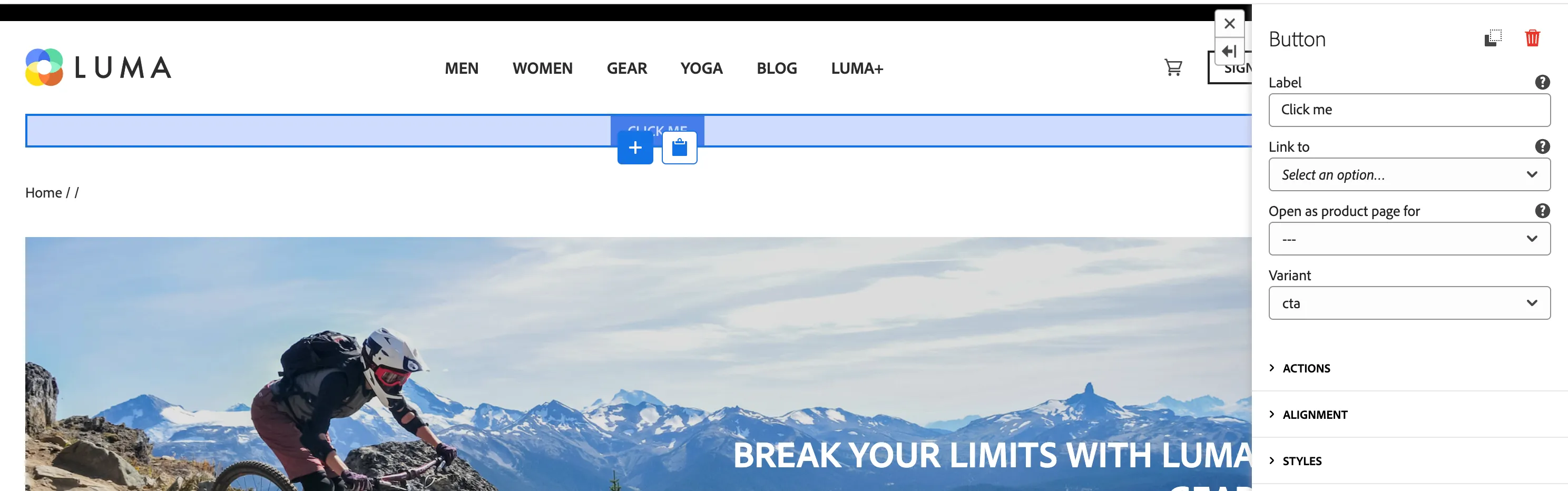
Properties
General
- Label - text to be displayed on the button
- Link to- screen to navigate to on click
- Open as product page (optional) - if you select Product template page in a Link to, select which product should be displayed on the product site.
- Variant - visual variant: cta, primary, secondary, negative, link
Actions
- Event Type - name (type) of event to generate on click. Used to trigger Data Collection Tag Property Rules. Leave empty for no event.
- Webhook URL - URL to which a request should be sent on click. Leave empty for no request.
- Form Id - used to filter properties to include in webhook request payload.
- Delay - Number of milliseconds to wait until navigating to a screen provided as "Link to"
- Toast Variant - type of toast that will be displayed on button click
- Toast message - message that will be displayed in toast after button click
Alignment
- Custom Data - additional properties to add to dataLayer/request payload on click.
- Styles section